


Produit(s)
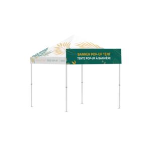
Bannière pour Tente popup 10x10
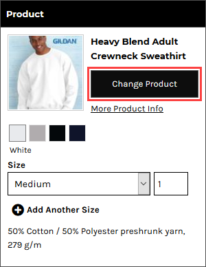
Changer de produit
Full Color
Quantité minimum: 1
Propriétés du Texte
Calques (Couches)
Emplacements
![[]](/images/loading-oval.svg)
 Patientez s'il-vous-plait

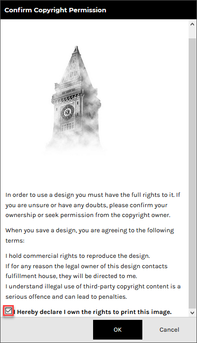
In order to use a design you must have the full rights to it. If you are unsure or have any doubts, please confirm your ownership or seek permission from the copyright owner.
When you save a design, you are agreeing to the following terms:
The uploaded image was resized to meet the 25 megapixel limit for raster images. The image may appear to be smaller than intended. You can avoid the raster size limit by uploading artwork in vector format when possible.
Vous serez redirigé vers une page où vous pourrez demander un devis pour ce produit non personnalisé. Toutes les décorations que vous avez ajoutées à ce produit seront supprimées.
| Produits | Qté | Prix | |
|---|---|---|---|
| Total | $0.00 | ||
Vous avez déjà utilisé la sérigraphie dans cette commande. Pour éviter des coûts d'écran supplémentaires, vous pouvez réutiliser une conception de sérigraphie existante pour ce produit.
Votre agencement contient des images qui ont été redimensionnées dans des proportions telles qu'elles pourraient apparaître floues.
Votre agencement contient des images qui apparaissent en dehors de la zone de dessin.
Vous ne pouvez pas enregistrer le produit avant d'avoir placer les images à l'intérieur de la zone de dessin.
Votre agencement contient des images qui apparaissent en dehors de la zone de dessin.
Votre agencement contient des images qui se chevauchent.
Vous ne pouvez pas enregistrer le produit avant d'avoir déplacer les images pour qu'elles ne se chevauchent plus.
L'achat d'un produit non personnalisé n'est pas autorisé
Vous ne pourrez pas acheter ce produit, sans le personnaliser.
Produit non décoré inactif, en cours d'utilisation
Quantité minimum requise non atteinte
Vous ne pourrez pas acheter cet article sans avoir augmenté la quantité.
Mise à jour d'Écran(s) toujours en cours...
Vous ne pourrez pas acheter cet article, tant que tous les écrans réutilisés n'auront pas été mis à jour.
Your layout contains images that have been resized to meet the 25 megapixel limit for raster images and they may appear smaller than intended. You can avoid the raster size limit by uploading artwork in vector format when possible.
En cliquant sur OK, vous consentez à accepter le produit final quelle que soit la qualité de ces images. Pressez Annuler si vous souhaitez revenir en arrière et rectifier les images.
The Designer is an easy to use tool that allows you to design your own product. You can select a product to decorate with stock art, your own designs or photos and text.

The Select Product popup will be displayed.

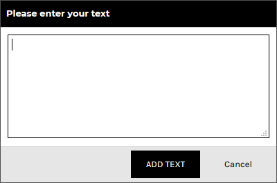
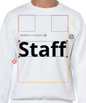
The text will appear inside the decoration area in its bounding box with editable size dimension, resize and rotate handles and delete control available.
The Text Properties panel will appear on the left side of the Designer.
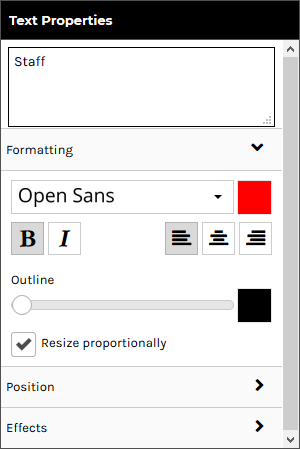
The Formatting tab is expanded by default and contains the following controls:
Effects are only available for the direct to garment printing decoration process.
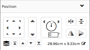
Click on the Position tab to expand it. Expanding the Position tab reveals the following controls:
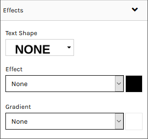
Click on the Effects tab to expand it. Expanding the Effects tab reveals the following text effects:


You can select designs from the following sources:
Raster, vector, and embroidery file types are supported in the formats as listed below:
Vector based graphics will have modifiable elements such as text and colors editable on the fly by users.
*CDR requires the CorelDRAW app to be enabled. When a CDR file is uploaded it will be automatically converted to SVG format so that it can be modified in the Online Designer.
The design will appear inside the decoration area in its bounding box with editable size dimension, resize and rotate handles and delete control available.
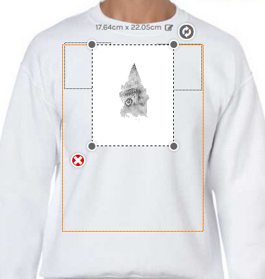
The decoration area will be highlighted when the mouse pointer is within its boundaries.
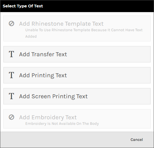
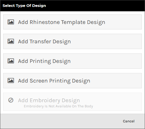
The Select Type of Design popup will be displayed with the supported decoration types enabled for the product selected.
The system will begin uploading the design file to your own design library.

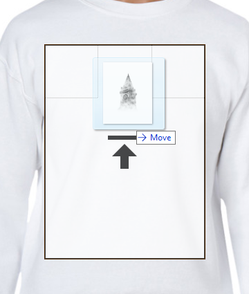
The design will appear inside the decoration area in its bounding box with editable size dimension, resize and rotate handles and delete control available.
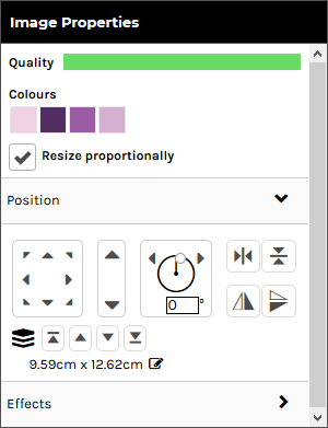
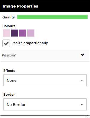
The Image Properties panel will appear on the left side of the Designer.
This option is only available for raster designs.
This option is not available for designs that have restrictions on customizing.
This option is not available for embroidery, transfer and rhinestone designs.
This option is only available vector-based designs.
Click on the Position tab to expand it. Expanding the Position tab reveals the following controls:
Click on the Effects tab to expand it. Expanding the Effects tab reveals the following controls:
These options are only available for raster designs.
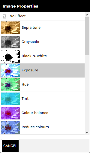
Click CANCEL to return to the Effects Panel.
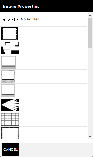
Click CANCEL to return to the Borders Panel.
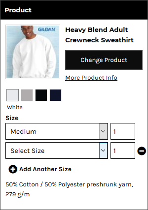
The Product panel is displayed.


The Product panel is displayed.

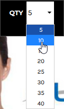
The Quantity field will show the minimum quantity you can purchase.
Note, you can not select multiple sizes when products are sold in bulk.

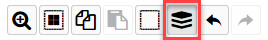
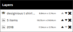
The Layers panel is displayed showing all the text and design objects present in the decoration area.
You can group elements from a template design that you have ungrouped.
The Layers panel is displayed showing all the text and design objects present in the decoration area.

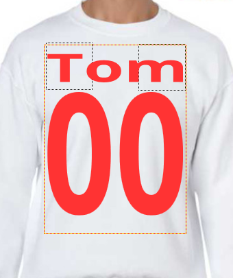
"Team name" allows automatic formatting of text in the form of a small name and large number beneath, decorated onto the product. This is useful for teams and other groups who would like a jersey-style name and number on their product.

The Add Team name popup will be displayed.

The Edit Team name popup will be displayed containing Name and Number fields to match the quantities specified in the Add Team name popup.
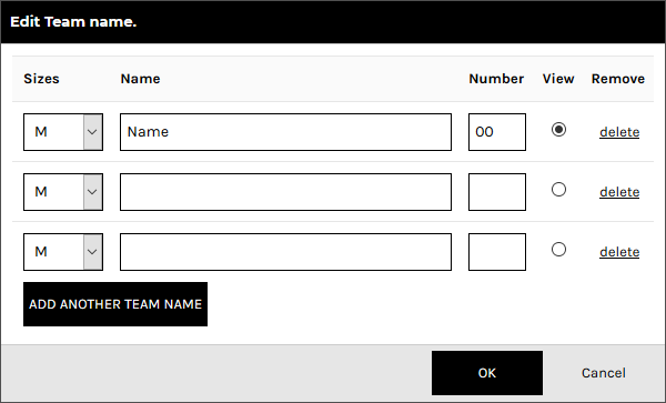
The item selected in the View column will be the item that is displayed in the Designer.
The team name and number will be set up on the product as text areas whose properties may be adjusted as per normal text, except that any changes made will apply to all team name products.
See the section, To adjust the properties of text in the Designer, above, for details on how to adjust the formatting, adjust the position and apply effects to the text fields.